In 2018, the customers had the power – not the seller.
Customers can make or break a business. With online reviews, forums and unlimited social media reach, customers can spread the word about a bad shopping experience faster than a bullet.
One bad wrap online and voilà – sales start dropping like flies.
It’s crucial to be aware of the experience you’re offering customers through your ecommerce store. Think images, product descriptions, shipping information and access to discounts – or at least opportunities to earn discounts. You need to “wow” customers and win them over. You need to leave a lasting impression and a positive one, at that.
Want to perfect the customer experience in your online store? Keep reading. We’ve got the top four methods of improving customer experience and retention online.
#1. Enable the customer experience with strong visuals and designs
Picture this.
You’re shopping online for Christmas presents. You’ve been web-surfing for a while now but nothing has jumped out and screamed, “PLEASE BUY ME.”
You find an interesting page with a hilarious (or at least engaging) URL. You expect something amazing but instead, you’re faced with a boring homepage with minimal images or interactive opportunities, minimal text and no backstory. There’s nothing about the page that makes you say “wow” and add sixteen products to the cart in a matter of seconds.
Disappointing, right?
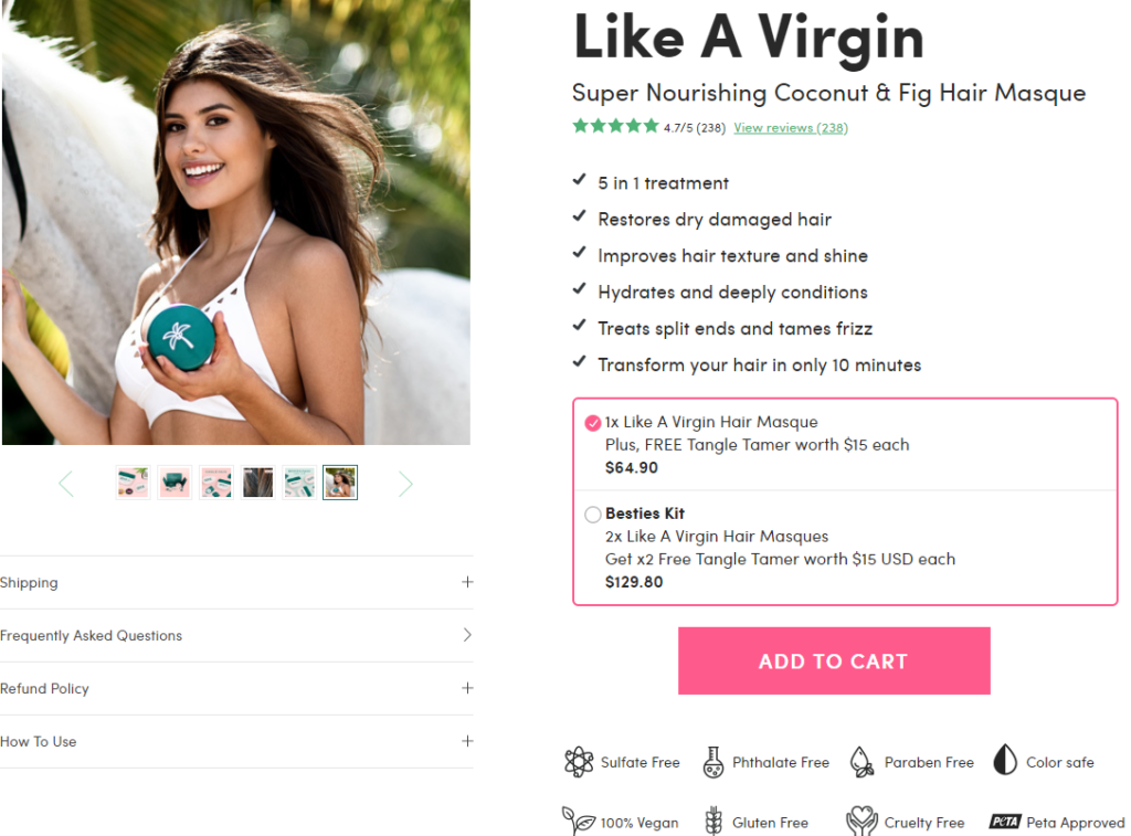
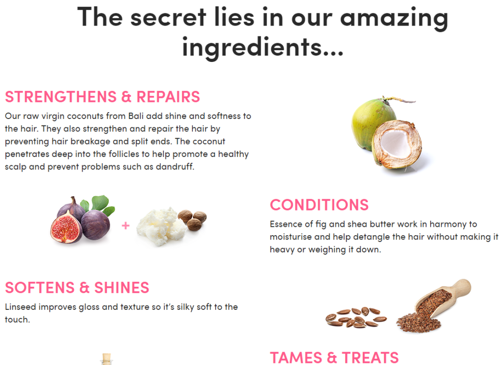
Now, look at Coco & Eve – Australian coconut and fig hair masque specialists.

This – believe it or not – is part of the homepage.
Coco & Eve have redefined the meaning of a homepage. Rather than sticking to the standard header, introduction, services, “contact us” and footer menu layout, Coco & Eve has turned their homepage into a glorified catalogue, filling the page with details about their product including ingredients, benefits, tips for use and even their shipping policies.
The brand offers strong visuals to entice their customers – detailed product descriptions, professional photos and graphics. It’s an easy process for customers to explore what Coco & Eve’s products are, and find the information needed to make a hassle-free purchase… without ever leaving the homepage.

Improving graphics, product descriptions and website design has proven, product-selling results. HubSpot – international digital marketing specialists – looked into the success of jarred food brand, Di Bruno Bros. HubSpot discovered that after implementing bold design strategies (similar to Coco & Eve), Di Bruno Bros boosted their online sales by 6.5%.
Those are some statistics that can’t be ignored.
If your product pages look sadder than the leftover salad at the back of the work fridge – invest in some product photography and let your customers get the “feel” of your products. If they can see three different angles and zoom in and out of the image, you’re on the right track.
#2. A/B test designs to discover what works best for your customers
Making even a simple design tweak to a website can be daunting. You have no idea if it’s going to improve sales or tank them, plus there could be a slew of technical issues waiting on the other side of the development process.
Nervous about making changes and disrupting your current shopping experience, but feel you could be boosting sales with a refined design or new approach? You might want to look into A/B testing.
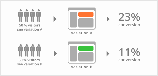
A/B testing compares two versions of a web page to see which one performs better. You show two different variants of a web page (i.e. A or B) to multiple customers at the same time. The variation which generates the most sales is the winner – and the best horse to bet on. See the graphic below.

Image: VWO
You can test new images, text, design elements and even different coloured “add to cart” buttons which are major attention-grabbers – all without strings attached. Discover what works best for customers – if the new design or changes lead to sales, you can feel confident making changes knowing it’s going to lead to a better result, plus a better customer service experience.
What comes next? Well, just kick-back with a mimosa and watch the customers come rolling in!
#3. Offer premium information with embedded shipping calculators
Got a website design that kicks-butt and runs as smooth as a refurbished Jaguar?
Nice work!
Now all you need is tonnes of premium shipping information, accessible via an advanced shipping calculator on all product pages.
According to digital marketers Visual Website Optimizer, 28% of shoppers will abandon their shopping cart if presented with unexpected shipping costs – meaning it’s essential to the customer experience to have shipping info front, centre and if possible, interactive.
At Transdirect, we offer premium shipping plug-ins and ecommerce integration for a range of ecommerce platforms including Magento, Woocommerce, Shopify, and even eBay. We have a postage calculator that creates a professional and interactive experience for shoppers – customers can receive instant and accurate shipping costs, making it simpler for them and save the effort of contacting you, the store-owner.
Check out our Developer’s Centre for more information about downloading our shipping calculators and plug-ins.
#4. Encourage customers to hand over their email address (then follow up with email)
Converting new customers is hard. In fact, the odds of landing a sale with a new customer falls between 5% and 20%, whereas existing customers are 60% to 70% more likely to buy.
Take advantage of this.
Part of the customer experience is building a positive, ongoing relationship with them – and turning them into existing, repeat customers. Considering the statistics above, it’s clear ecommerce business owners need to focus on customer retention just as much as winning fresh new sales.
Your strongest chance of increasing sales and building a relationship with customers is email automation. Think “welcome” emails, “abandoned cart” emails and notifications about sales, promotions or discounts. We all get ‘em – and it’s time to join the financial gain train.
You can set up email automation flows to get in touch with customers without having to lift a finger (after the initial set-up, of course). You can keep sipping mimosas, stress and obligation free.
Customers aren’t going to just hand over their email address, though. A popular and successful method of encouraging customers to sign-up for email newsletters and notifications is offering special deals or discounts.
Here at Transdirect, for example, we offer up to 30% off shipping and services when customers sign up to become a member with us. We treat our customers to a sweet discount and you’ll also receive informative emails from us about our services, plus Ecommerce business advice from the pros.

Keeping in touch with customers and offering deals is a proven method of customer retention. On average, businesses with email automation strategies end up with a 7% increase in sales.
Keep customers wanting more – perfect the customer experience you offer online
Offering a positive experience for customers is now more crucial than ever before.
Frustrated, fed-up customers who leave negative reviews online can do major damage to both your reputation and your sales – 60% of people who read negative reviews choose not to engage with a business, so it’s important to ensure online shopping is smooth-sailing for customers at all times.
No bugs in the website design. No pixelated graphics.
Just lots of relevant follow-up emails (complete with discounts) to show you care, visual extravaganzas through graphics and professional photos, and of course, tailored shipping information for a fast, simple and unsurprising check-out process.
Need help with the shipping stuff? Get in touch with our team today. We can fix you up in a jiffy.